The triangular shaped food pyramid served us valiantly for several years, teaching school-aged children the value of a balanced diet while helping health-conscious adults stay mindful of their daily food intake. However, recent studies are suggesting that its time in the limelight is finally over. Outdated, incorrect, and formulated to support national agriculture, the traditionally accepted food pyramid that we all know and love is now being replaced by something much simpler and healthier.
New nutritional guidelines are being developed by Belgium’s Health Council as we speak, with updated recommendations that focus primarily on the unique needs of modern-day people and less on the agendas of the agriculture and dairy industries. The old food pyramid hasn’t been examined or updated in over a decade and a half, so it’s abundantly clear that this new model deserves attention.
What’s Happening to the Pyramid?
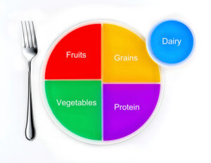
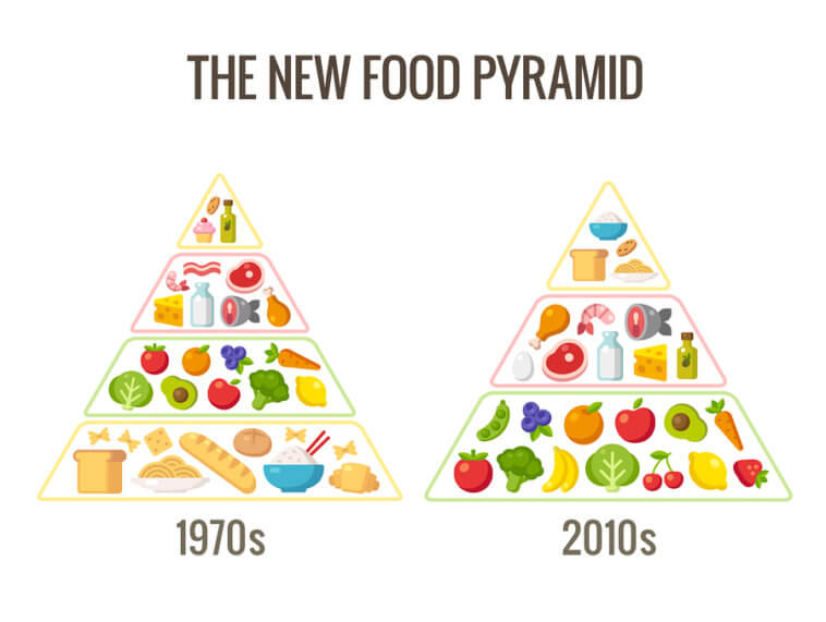
The Netherlands and Switzerland have already adopted a new way of thinking about food. Their updated nutritional guidelines replace the grains and starches located at the bottom portion of the old pyramid with healthier fruit and veggie selections. In America, the widely used food pyramid is being swiftly swapped out for a simple plate divided into four basic food group portions. The new nutritional icon is not only more concise but it’s also helpful in the fight against obesity and diabetes.
 The updated pyramid, often referred to as simply “My Plate,” is based solely on the government’s Dietary Guidelines for Americans, virtually ignoring the agendas of the diary and agriculture industries that, for so long, influenced what our country perceived as healthy eating. The four sections: grains, protein, fruits, and vegetables, are sized according to the amount each eater should consume with every meal. Interestingly, the grains and starches are no longer the largest portion, replaced now with fruits and veggies which occupy more than half the plate’s circumference.
America has, however, remembered the importance of dairy although the food group is not contained within the newly designed plate. Instead, a small dairy portion appears adjacent to the plate suggesting that the best source of dairy is simply a cold glass of milk. Nutritional experts believe that the updated and simplified guidelines will serve as a sort of visual aid that encourages consumers to make better food choices – something that the old food pyramid just couldn’t pull off.
What Was Wrong with the Old Model?
 First introduced back in 1992, the U.S. Department of Agriculture (USDA) admitted that the old food pyramid was both complicated and unclear. Although it was revised in 2005, the food pyramid remained a complex symbol that left many Americans unclear as to how they should structure meal time. This, in part, led to an epidemic of weight gain, diabetes, heart disease, and other health problems.
The old pyramid featured a triangular shape which placed grains, veggies, and fruit at the base to symbolize the foods people should eat most often. On the top of the pyramid were meats, dairy, and sugar, symbolizing the foods people should enjoy sparingly. And while there was some validity to those potion sizes, none of them translated well for the average person.
Consumers were advised to eat a specified number of servings in each food group, but that required folks to measure every bite they took. Furthermore, the pyramid failed to distinguish the difference between healthy and unhealthy foods within each group (baked chicken vs. sausage, for example). Additionally, the pyramid’s overall design was intentionally tweaked to accommodate the market, not the eater.
Even the revamped 2005 version of the old food pyramid had its shortcomings. It transformed the original design into a farce, with colorful shapes used to represent each food group and a corny stick figure running up the side to encourage working out. Over time, the design became increasingly ridiculed for not offering any real or meaningful help.
How Does the Updated Design Work Better?
The circular design of the new guideline serves as a much better representation of how the average human being eats. In a busy society, most people don’t have the time, patience, energy, or interest to be a frugal nutritionist who carefully measures food portions and differentiates between healthy and unhealthy options within in each food group. The new design also encourages people to eat less overall, which in turn helps to reduce obesity, diabetes, and other health concerns.


Comments
Loading…